Minggu, 31 Maret 2013

Happy Easter !


Wishing you all a Happy Easter !
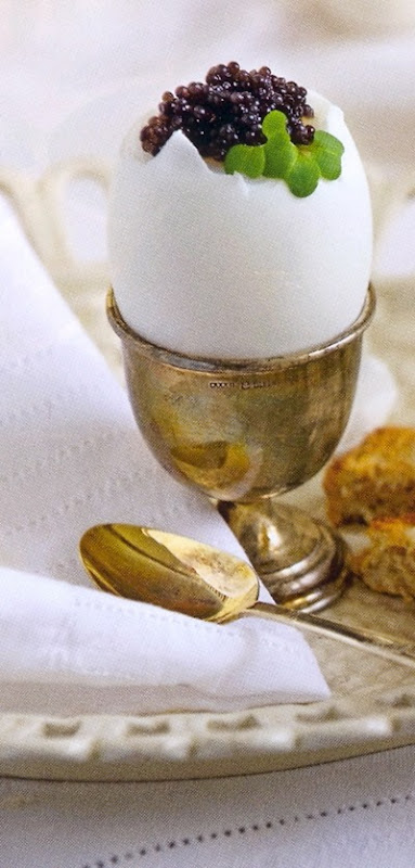
 

Wohnen Träume 1-2013 (1) Source Magazine Wohnen-Träume 1-2013


xx

Greet

Jumat, 29 Maret 2013

‘Esprit 18ième’ yet to notice in our living room


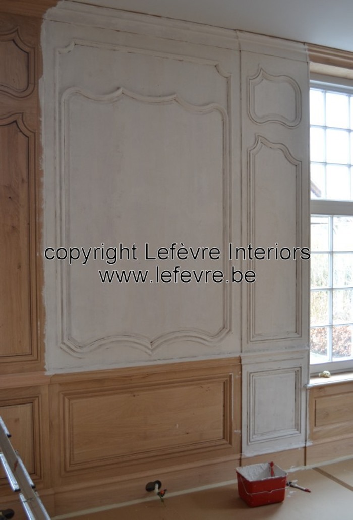
I am pleased to update you about our living room redo because yesterday the painter started to bring on the final layer of paint over the wood.

We were very thrilled to watch the painter adding so many layers of paint to create that French 18th century look of our paneling.

Even though only a part of the paneling is yet painted, we do feel the spirit of the 18th century already. Don’t you ?


3A picture never can show the exact color of the patina. We have chosen for a shade of gray-green.


I show you here some pictures of our painter at work, the previous days.

Many layers of paint were added on the oak wood of the paneling.

7

2

8

4

We really had to be very patient to finally see the result. But it’s worth it !

5


10


I just love the detail of this moulding.

9Natural oak

1Patina finish

What a change this patina created !

12

I do hope you all enjoyed this update post ?!


To be continued…

If you are interested in my previous posts about our living room redo, please click here, here, here, here and here.


I wish you all a wonderful Easter Weekend !

xx

Greet


If you would like us to help designing and manufacturing your paneling, feel free to contact us at info@lefevre.be

For more Lefèvre Interiors realisations visit our website at www.lefevre.be

Kamis, 28 Maret 2013

Paint by Number Ballerinas: Buy or Pass?

 
I spotted this exact pair of vintage paint by number ballerinas at Value Village the other day and I kind of can't get them off my mind.  I can't help but think how fabulous they would look in a nursery (future clients?). There is something so whimsical, quirky and fashionably kitschy about paint by numbers. I might pop in after work and see if they are still there.... At 15$ a piece they are a bit pricey for Value Village in my opinion, but I still think a good value over all.

What do you think? Should I buy them or pass?
Also, I would love it if you guys checked out my Term 2 Final Project that I posted yesterday! It's the condo I've been talking about for the past little while finally complete. It was a lot of hard work and I am proud to show it off ;)
Photobucket

Rabu, 27 Maret 2013

Term 2 Final Project: Condo Design

In case you're wondering where I've been the past couple of day, the answer is holed up in my room crafting away. I've never crafted so hard, I actually woke up stiff today....who knew that was even possible?!
But finally, 8 presentation boards, a small fortune and over 100 hours of work later, I am done my term two final project! I'm thrilled to be able to share the final product with all of you today! Cue the photo overload (and the champagne):


I am really proud of the way everything turned out. When I look back at my Term 1 Final Project, I am in disbelief at how far my skill set has improved in just three short months. I can't even imagine what I will be able to do by the end of my final term, Term 12!
Photobucket

Senin, 25 Maret 2013

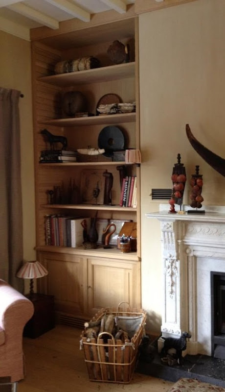
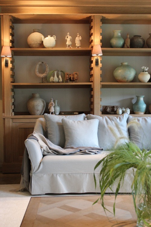
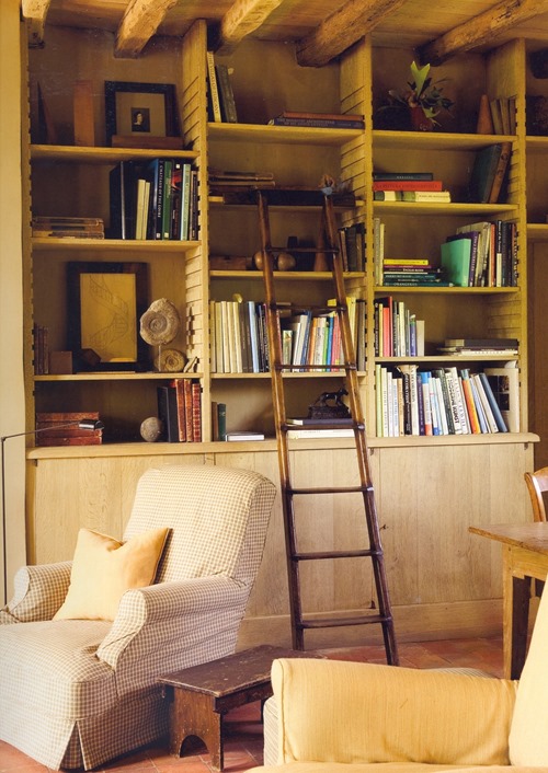
Belgian designed oak cabinets


Oak cabinetry used as display cabinets or library bookcases.

Designed by Belgian designers.


2Design by Interior Designer Natalie Haegeman – realisation Lefèvre Interiors  Photo credit Natalie Haegeman


1Design by Home World of Interiors 


3Design by Interior Architect Catherine De Vil   Photo credit Jan Verlinde


I would love to hear your thoughts about the cabinet design !


xx

Greet

Jumat, 22 Maret 2013

Armless Sofas & Where to Use Them

I love the look of armless sofas. So clean, elegant, and streamlined. The arms on sofas can really create a lot of visual bulk, so this is a good option if you want a lighter look.
via MMR Interiors
via Joe Nye Inc.
For me, it's all about using these beautiful pieces in the right setting because there are some situations where I feel armless is just not the way to go.

Firstly, I would avoid using one as your only sofa option in a TV area. Speaking from personal experience, they are not very comfortable to sprawl out on to watch TV. There is no where to rest your head if you want to lay down, and if you try to pile up pillows for the head rest they end up slipping off eventually. I, for one, have a very difficult time watching TV in an upright position. Bring on the cuddling, blankets and popcorn puh-lease!

 An armless sofa can also cause problems when multiple people are sitting on it because you can't lean away from each other! Arms allow you to lean away from the person next to you, giving you your personal space and allowing you to comfortably look and chat with eachother. With nowhere to lean, this is only achieved with the uncomfortable neck turn.

For me, it's all about using these beautiful pieces in the right setting, such as a more formal seating area, a dining space, and smaller areas like a foyer. They are also great as a secondary seating option in any room.
via Elle Decor
via Habitually Chic
via Lonny
What's your take on armless sofas? I'm personally lusting over the first and last examples!
xox
Photobucket

Kamis, 21 Maret 2013

Living room redo progress


Dear friends and readers, the previous days the artist-painter added the undercoat to the paneling of our living room.

010Oak paneling before the primer was added.


02Start of adding the first coat.


Even though this is only a primer, it has given the room a completely different look. Don’t you think so ?

01

Actually you can’t see that much of the timber anymore, but in one of the next steps, the painter will gently reveal the oak wood.


04

The panel moulding is much more accentuated than before, which I really love.


08


09

This is how our living room looks like today.

I can’t wait to see the painter adding the next layers !


07

Me, explaining how I would love to see the patina which has to be added next week.

We asked the painter to make a lot of patina samples but untill now, we haven’t made our choice ! This really is the hardest part !

To be continued…


If you are interested in previous posts about our living room redo, please click here, here, here and here.


xx

Greet


If you would like us to help designing and manufacturing your paneling, feel free to contact us at info@lefevre.be

For more Lefèvre Interiors realisations visit our website at www.lefevre.be

Rabu, 20 Maret 2013

Rendering Wednesdays: Powder Room

Remember when I used to post a doodle every Wednesday? I miss that. So I thought today I would share a rendering that I did for my final condo project (which I hope you guys are not sick of hearing about yet because it's consuming my life at the moment therefore all I really have to talk about!).

Last week I shared the wallpaper I have chosen for the powder room with you. I loved the little moodboard so much that I decided to try my hand at rendering the space for my presentation boards!

Mirror (vintage) / Sink&Vanity / Hand Towel / Basket / Pendant / Mineral Art Work

I also rendered the kitchen yesterday, and am starting the living room today!
Learning to draw in perspective and render this term has been so much fun because it allows me to really envision my designs come to life. I think it will be a great tool in my designer belt!
xox
Photobucket

Selasa, 19 Maret 2013

The Prettiest Chandelier I've Ever Seen

Can we just discuss this chandelier for a moment:
 I personally, cannot, as I'm left rather speechless by it. I've always loved murano chandeliers, and the bubble gum pink is almost more than I can bear. And the fabric on those louis chairs?! Heavenly.
This is the house of Pete and Bailey McCarthy as featured on Design*Sponge. It's pure amazingness, a big thanks to Elizabeth for tipping me off to it. I dare you to count their bathrooms!
xox
Photobucket

Senin, 18 Maret 2013

Black Framed Showers

I've always loved the look of old (or new) black framed windows. I think it's such a handsome, masculine and historical look. That's why as of late I'm really enjoying the black framed showers I've been spotting on Pinterest!
via Pinterest
via M Rodgers Ltd.
Bailey Mccarthy via Design*Sponge
^That last image seriously has my heart. The gold, black and white is such a classic and glamorous combination!
What do you think of this look?
Photobucket