Jumat, 31 Mei 2013

Cluttered Fridge Doors

Growing up, my family fridge door was never bare. It was covered in my art work, magnets from our vacations, small poems my mom clipped out of the paper, party invitations, papers we got a good mark on. I loved it like that... Which is why I love the following image from Amy & Erich Mcvey's kitchen so much:
via design*sponge
The fact that the exposed parts are pink only adds to it's charm.
Of course, If you've spent a lot of money on a gorgeous top of the line appliance, you probably don't want to cover it up. But if your fridge is say...less than attractive, isn't this a great idea?

And today one of my dear blogging friends Elizabeth from Little Black Door is sharing her nursery ideas over at the party. You don't want to miss it!
Photobucket

Kamis, 30 Mei 2013

Thinking about Pom Pom Curtains

So in my rental I still have not put up curtains. Truthfully, I'm not sure if I ever will...I plan to but between my budget and my busy schedule it hasn't been number one on my to-do list.
The only real downside (other than the room not being fully decorated) is that my blinds let in a lot of light super early in the morning.  Which has me thinking if I were to get curtains...what would I get?

And for me the obvious answer is pom pom curtains. They are so fun and if a girl can't rock some pom pom curtains when she's living alone then when can she really? The first time I saw pom pom curtains is when Sarah Richardson did them for a blue and orange nursery, in fact, I most often see them in nurseries now. But trust me when I say that they can be used in the most grown up spaces as well. I'll prove it!:
brittanyMakes via Sadie and Stella
^ I adore Brittany's eclectic living room. The gold fame has my heart. Obviously so do the curtains.
via 6th Street Design School
^ My girl Elizabeth rocked them out in her living room and trust me when I say that woman can do no wrong.

via
^ The pom poms actually add sophistication to this canopy. Who knew something so fun could look so sharp?

via
^Is this not the happiest kitchen you've ever seen? The pom poms look like confetti! Perfect for any baker.
via
^ A bright happy space deserves bright happy curtain trim. duh.

So what do you guys think? Only for nurseries or for any room in the house. For me, it's that perfect little bit of unexpected quirk that every room needs. Oh yeah and POM POMS, just in case I didn't say it enough in this post. It is fun to say...
xo
Photobucket

Rabu, 29 Mei 2013

Ideas to change or to upgrade your room


Hello my friends, how are you today? And how is the weather like in your country? Here in Belgium it is raining at this very moment! Summer seems to forget our small country this year! I really need some sunshine…Let’s hope summer will come along in the month of June!


Today some great ideas to change or to upgrade your rooms.

What do you think about placing a small window to peep into that other room?
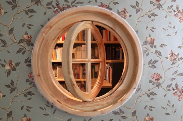
7Source here


Add console brackets onto the ceiling beams.
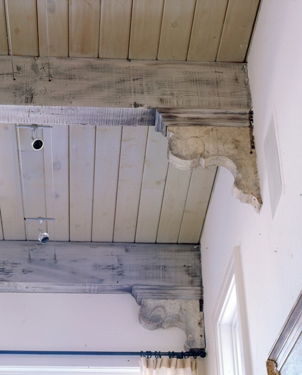
2Source unknown


My friend Leslie, owner of the Houston based company Segreto Finshes, painted a client's favorite wine label in a barrel ceiling in a wine room. Isn’t this a splendid idea?

To see more of the exquisite Segreto Finishes projects, visit their website HERE. You all should start to follow Leslie’s beautiful and inspirational blog HERE. Leslie is posting a lot of her projects in progress!  So interesting to see the ‘before and after’ pictures.
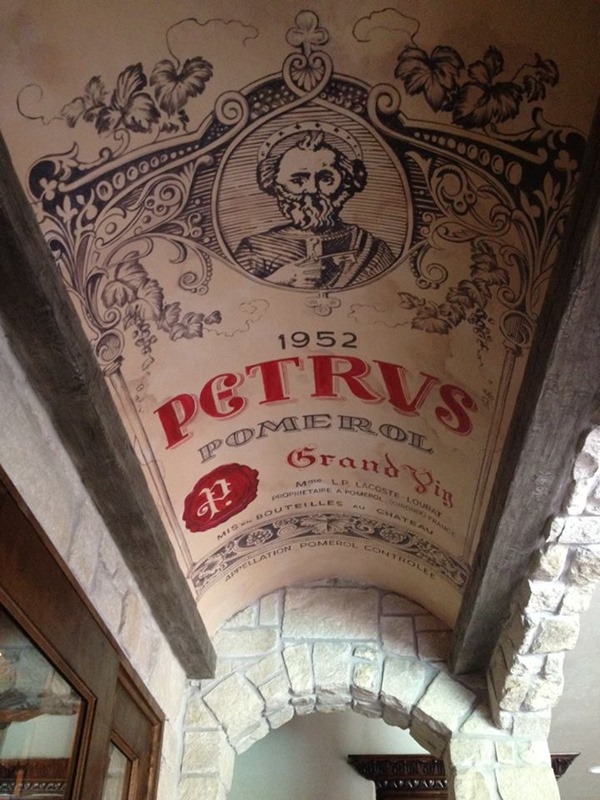
1Segreto Finishes    Source FB page Segreto Finishes


Try to bring in the fire place under the staircase of your entry hall. So inviting!
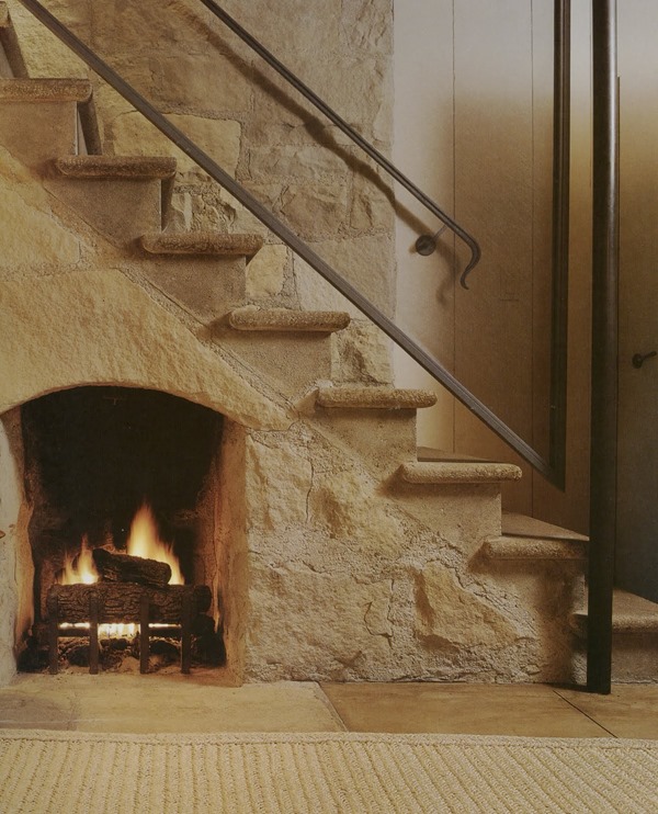
5John Saladino   Source here


Do you need more storage? Don’t worry! Make a drawer of every step!
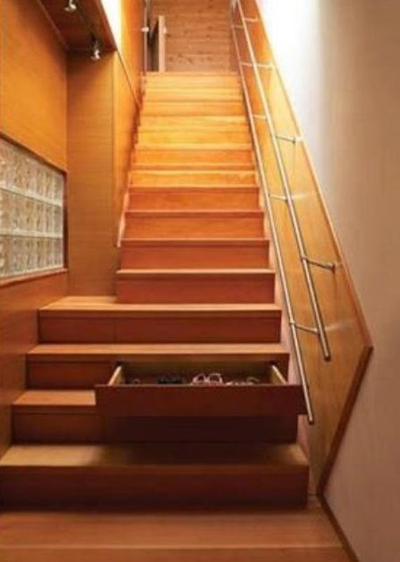
12Source here


Go for a a cube patterned floor. This will give your room a completely different dimension.
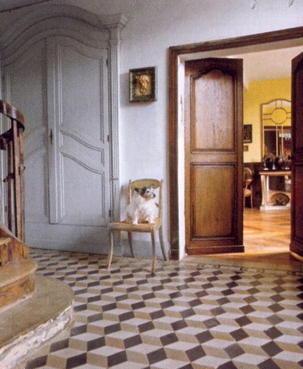
6Lapicida    Source Homes & Gardens – May 2013


Decorate a niche with a drawing.
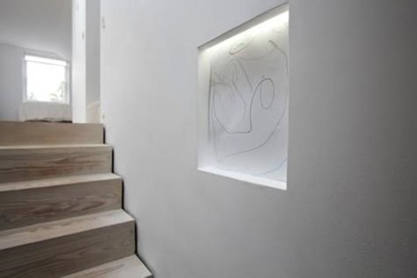
13Source here


Closet hooks that are functional and decorative at the same time.
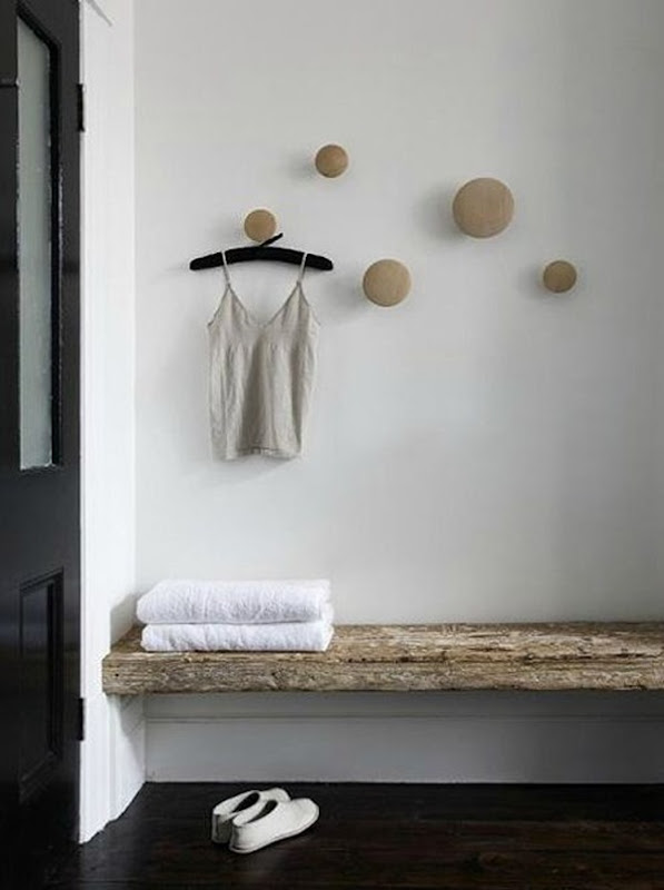
10Source unknown


Make your bathroom accessories and products invisible !
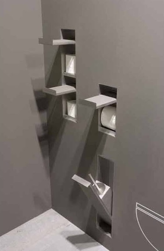
8Antonio Lupi   Source here


Choose some original hardware for your kitchen cabinetry.
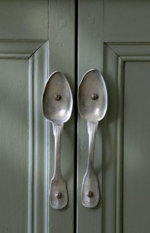
3Source unknown


Are you a dog lover ? Well then, look at these great ideas to enter the pet bowls into your kitchen !

Notice the bone shaped front opening on the drawers !!!
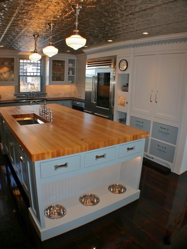
11Source here


Great idea for the biggest of your darling ones!
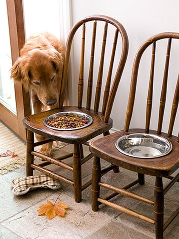
15Source here

I hope these ideas inspired you ?

xx

Greet

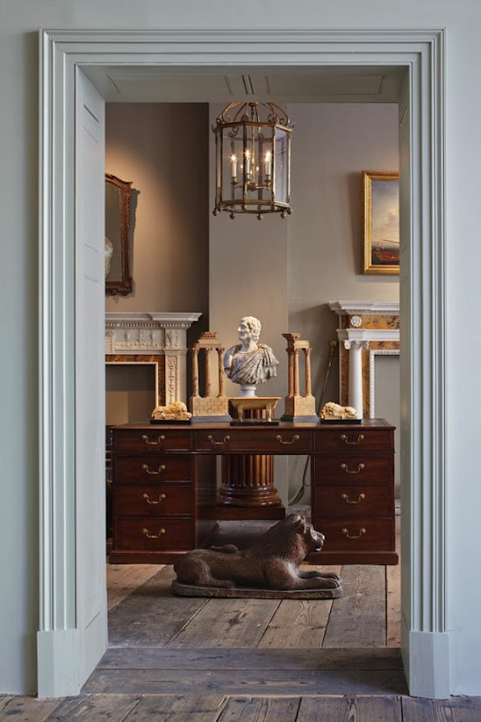
Watercolor Wednesdays: Glamorous Desk Vignette

Today's watercolor is inspired by one of my favourite images that I've seen floating around the internet lately. It feels so glamorous and layered and sophisticated and collected.
Does anybody know the original source?

Happy Wednesday!
Photobucket

Selasa, 28 Mei 2013

Living Room Paint: Masculine and Feminine

I'm pretty color shy when it comes to walls. I love white walls because it feels crisp, light, and allows your other pieces to really pop and take center stage. But there are two bold colours that I would gladly paint a living room..and they couldn't be more opposite!

Masculine: Navy
via
 If white is a crisp neutral, navy is it's moody counterpart, instantly cozying up the space. I Like it when the trim is painted out as well. The high gloss factor in the picture above is making me very happy.

Feminine: Pale Pink
via Style at Home
 We are talking VERY pale here people. Christine Dovey does it perfectly in her living room above. It is delicate without being in your face girly, and compliments her treasures so well.

Would you do navy or pale pink? Or neither! xo
Photobucket

Jumat, 24 Mei 2013

Tiffany & Co. Reception - Completed Project

A couple of weeks ago I shared some sneak peek shots of the Tiffany & Co. reception area that I designed for a school project, but it was all crinkled and the pictures were horrible quality.Today I wanted to show you the completed project, including my presentation boards, floor plan, elevations and perspective drawing! It looks so much smoother now that it is glued down.
I wanted to create a sense of classic luxury and refined style that reflected the company's long history in the jewelry business. It was a fun to render in all the architectural detailing. The design was inspired by the exterior of the Tiffany's in Soho:
via Architectural Digest
And my best friend Laura gifted me this sweet little print, which I think ties in just so perfectly with today's post:
I love it!
Lastly, don't forget to hop on over and check out this weeks nursery at the Baby Blog Party! Have a great weekend xo.
Photobucket

Kamis, 23 Mei 2013

Kantha Throws from Dignify

We all know that anything that adds a tribal or global flare to decor is right on trend right now.
This includes Kantha throws, which are made from saris and sewn together using a traditional kantha stitch.
 I was recently contacted by the owner of Dignify, and after checking out the site, instantly fell in love with their gorgeous selection of Kanthas, all made from 6 layers of vintage saris!

The thing I love about Dignify (even more than the fabulous throws and other home accessories) is the company's mission is to provide dignity and livelihood for the creators of the products.
Dignify was sweet enough to send me a beautiful little sample of one of their Kantha throws.
It is so soft and lovely! In the package was a powerful and moving story about one of the kantha craftswoman in Bangladesh, who has struggled through physical abuse, sexual abuse, and poverty while trying to support her son before being embraced by the Dignify community.
So if you happen to be in the market for a Kantha throw, I highly recommend Dignify
This is not a sponsored post, just something I believe in!
xo
Photobucket