Tampilkan postingan dengan label interior design. Tampilkan semua postingan

Rabu, 15 Januari 2014

Watercolour Wednesday's: Shiny Floors

Last term my entire rendering class was done using watercolour, so I have a lot to show you! This week, I'm sharing a practice exercise we did based on page 21 of "Interior Design Illustrated: Marker and Watercolor Techniques" by Christina M. Scalise. This is one of my favourite books that I've had to buy for school.
I love the way this painting turned out and I really feel that the floors look successfully shiny (maybe even a little slippery!). Happy Wednesday.
xox
Photobucket

Selasa, 07 Januari 2014

Term 5 Final Project: Advanced Residential / Piano Mansion

Do you all remember me talking about my major studio project for the fall, and then basically disappearing off the face of the blogging earth? Well, let's just say that this project consumed and challenged me more than any project to date, but that the satisfaction of completing it (and getting a great mark) was well worth the long hours, piles of discarded ideas, and even tears.

If you recall, my original concept for the house was the piano (as the client is a family of musicians), but as I developed the project further, I moved away from such a literal shape and idea into a larger concept of the stage and performance, into a liveable concert hall idea. I kept some of my original concept, such as the pitched roof, but basically, I wanted the home to capture and reflect the feeling of grandeur associated with attending a night at the theatre, as well as creating a liveable environment that was simultaneously conducive to entertaining, parties and performance. Here is the final result (click on photos to see them in larger format):
I was basically architect, structural engineer, landscaper and interior designer for this project and I also had to consider barrier free elements as one family member is in a wheelchair...did I mention the plot of land we were given was on a cliff like hill? That's a lot of hats to wear in ten short weeks, but I am so happy I pulled it off and proud of myself for not giving up!

Here's to a new term! xo
Photobucket

Kamis, 24 Oktober 2013

Advanced Residential Project Inspiration: Piano Room & Sketches

First and foremost, I want to send a huge thank you and a warm hug out to each and every one of you for the overwhelming amount of support, encouragement and positive messages that I received through the blog, instagram and e-mail regarding yesterday's post. My heart is so full at the thought of this community and all we do for one another. :) You are the best.

Now onto a more fun topic. Last week I shared some details on this term's design studio - a 4000 square foot residential property which we get to design from the ground up. We received the program and the occupants are a family of talented musicians. They have a grand piano.
I actually took piano lessons when I was younger and while I never made it too far (I always hated practicing when I could be outside playing) I still plan on taking my piano with me into my first real house. All of this led me on a hunt for some piano room eye candy.
Stacey Brandford Photography via Desire to Inspire
via Robert Brown Interior Design
Atlanta Homes and Lifestyles via Little Green Notebook
I'm consulting with a talented piano playing young man (we will call him M.) on this project as a client sounding board. He says he would want a wood coloured grand piano, rather than black. Something like this I'm thinking...
via Markdsikes
I mean, burled wood? Let me pick my jaw up off the ground. Simply stunning.

 And while I know last week I said that my favourite old house is the direction I wanted to go in architecturally, I am now considering really running with this piano concept. I've sketched up some ideas for the shape of the house inspired by the shape of the piano and am really digging it. Realistically when am I ever going to be able to design a budgetless custom mansion? NEVER! Why not push myself to do something outside of the box? Here's a peek at my initial brainstorming work:
I might have to start practicing again, feeling inspired! Do you play an instrument?
xox
Photobucket

Senin, 21 Oktober 2013

One Room - Two Palettes: Transitioning your Home Decor for Fall in Five Minutes

We all know that the big trend I am loving for fall is black and white. I say 'trend' because it's a popular look this season, but let's face it, black and white is about as classic and timeless as it comes. While during the spring and summer my space employs a bright, lively and colorful palette, I decided to try on a different look for the colder seasons and went glam with black white and gold.
The changes were simple and only took about five minutes to complete. I didn't buy anything new, just used items I already had around my place.This goes to show you that switching up your decor doesn't have to cost a lot of money or take a lot of time. Also don't be afraid to improvise! The dalmation dot pillow cover is really a dress from H&M tied around a pillow form. Shh don't tell!
First I switched out the art pieces. Next I traded the colourful throw pillows. Lastly, I changed the items in my tray to fit the scheme.
Decorating Tip: Removing the dustjacket off of your books will often reveal more neutral covers!
I like any excuse to play around and experiment with styling. Do you change the palette of your rooms with the seasons? I hope you all had a great weekend
xox
Photobucket

Senin, 30 September 2013

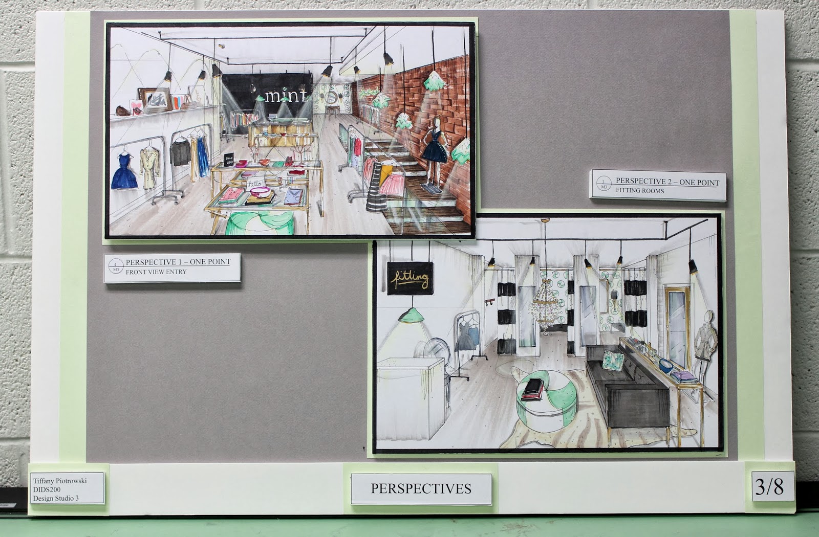
Term Four Final Project (& Tips for Creating your own Design Boards)

I did it! I survived my fourth project week.
This one was a big one - Each term more is expected of us as our knowledge base grows. I can't believe I'm officially 1/3 done my degree already. How time flies!
Today I thought I would share my final project and some tips for creating professional looking design boards (for all those fellow design students following my blog! xo)
 1. Be consistent. All of your boards should look exactly the same if you were to take all of your images off of them. I like to prepare my boards with a grey background (complimentary to almost anything & allows your work to shine) and a second pop of colour that goes with the scheme of my design. In this case a fresh, minty green.
2.Don't overcrowd your boards. It will overwhelm the viewer and look messy! Also, everything you put on your board should be mounted on a piece of foam core to create dimension and layers. Shout out to the lovely Steph Sterjovski- I used her picture as the perfect 'mint shopper' inspiration!
3. Your first board should always outline your design concept. Use a small group of images & the concept statement. I also like to highlight the three key words that illustrate the feeling I am trying to create with my design.
4. Use a title block at the bottom of each board with your name & class title, board title, and board number.
 5. Your renderings should be the stars of the show. They will pop more if they are surrounded by a black boarder.
 6. Try not to put all of your boards together in one day or by your eighth board things might start getting a little crooked and sloppy (see above ^).

 7. Always dress to match your boards. Just do it.
Warnings: Doing these boards is costly, time consuming, and will result in major 'designer bags'...and not the good kind of designer bags. I'm talking the ones under your eyes here people. Proof is in the pudding:
I'm very proud of how far I've come in one short year!! I can't imagine where I will be when I graduate. This week I am visiting my parents in Waterloo before term 5 starts on October 7th!
xoxo
Photobucket

Kamis, 18 Juli 2013

Thrifted Thursdays: Love on Sunday

Is it Thursday already? Time is flying my loves.
Today is a fun day because I'm over at Love on Sunday sharing my favourite thrifted find. You better believe that playing favourites with my treasures is no easy task...can you guess what I chose?

Amy is awesome. She is a fellow Toronto blogger (holla!) and design enthusiast. She is even in design school too! Pretty much twins, you know? Take a look at her fabulous city home:
Her styling is too good, right? That second image is so very Kelly Wearstler and has my heart. 
I'm now more convinced than ever that I need a nude... are you blushing?

So head on over and see if you're right about my fave thrifted item and to fall in love with Amy's blog! And don't forget to enter yesterday's giveaway if you know anyone with a baby in their lives...
Photobucket