Rabu, 30 Oktober 2013

A paneled bedroom


Today I would like to tell you something more about the design of a bedroom I am currently working on.

One of our clients asked us for help to design and to decorate their master bedroom. They definitely wanted to see their bedroom paneled. As our company Lefèvre Interiors is known for creating paneling, custom made, according to tradition, I was very pleased to start designing this bedroom.

After having browsed a huge file of bedroom images, this image of a bedroom designed by William Heffner, was definitely the kind of bedroom my client wanted us to realize !
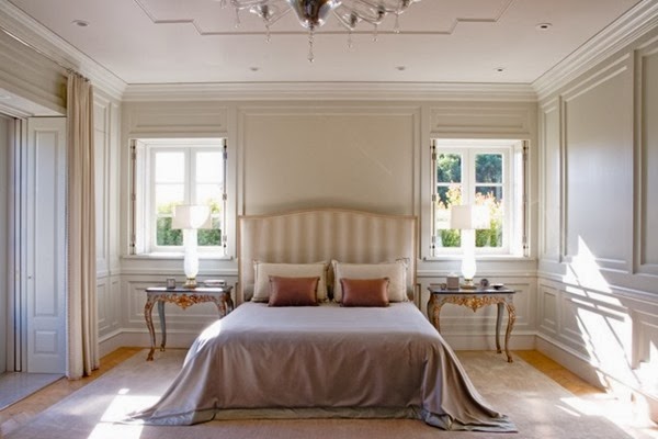
1Interior design by William Heffner


I had to take into account that our client absolutely wanted to see a fireplace in the bedroom.
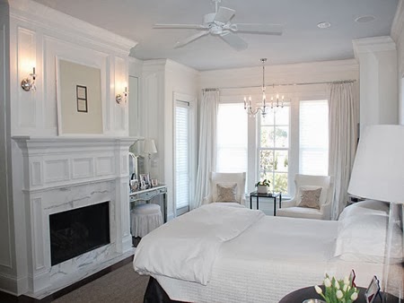
2Image source Home Bunch


After having discussed our sketches, we started to make the final plans of the bedroom.

Paneled bedroom Lefèvre Interiors www.lefevre.bePlan for paneled bedroom  -  Lefèvre Interiors


The montage of the paneled room is finished.

Below you can see pictures of the paneled room finished with a base coat.

Paneled bedroom with base coatPaneled bedroom with a white painted base coat - Lefèvre Interiors


In the meantime, I prepared a proposal of the color palette to use in this bedroom.

3Images : source unknown


As the master bedroom looks out over the beautiful garden, I suggested to bring in a shade of green into the room.

The niches on both sides of the fireplace are of French oak, which I wanted to be limepainted in a shade of green.

5I made a selection of Farrow & Ball paint colors for the room,

together with a selection of fabrics and furniture finishes.

Belgian linen will be used for the window treatment.

Color palette

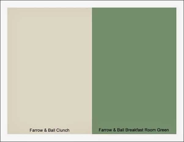
We finally have chosen for F&B Clunch to finish the paneling and F&B Breakfast Room Green to limepaint the display niches.

Farrow & Ball paint colors

I do know that what you see here on this picture below doesn’t look as the chosen colors, but you have to know that it is almost impossible to reproduce the exact colors. Taking these pictures, the niche LED lights arranged in lighting strips were turned on. And using a lime paint finish on oak wood has a totally different look than using an eggshell paint finish.

Paneled bedroom finishedFinished room paneling - Lefèvre Interiors


The previous days I was thinking about the decoration of the bedroom and I would love to see some beautiful decorative items displayed in the niches on both sides of the mantelpiece.
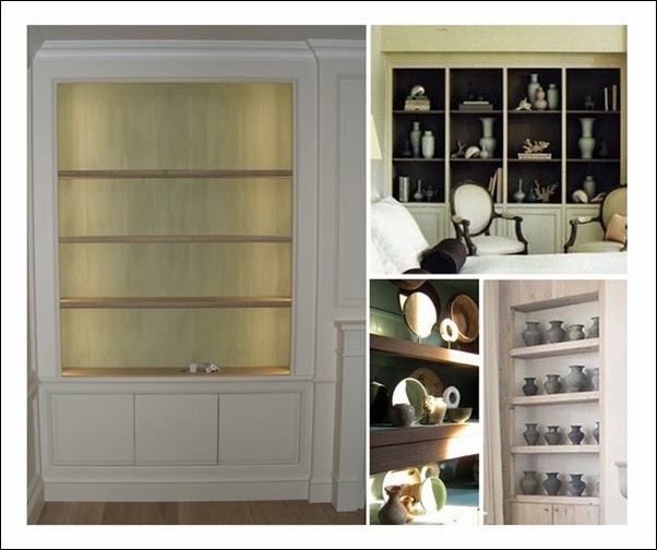
Decoration open cabinetryImages source clockwise : Lefèvre Interiors; Mary McDonald; Atelier AM via Veranda; Home Interiors


Our client still has to make a lot of choices before the bedroom is totally finished. Furniture, bedding, nightstands, lighting fixtures, bedlinen,…

Vaughan sconcesSconces Vaughan


I would love to see the nightstands with a cream or celadon finish.
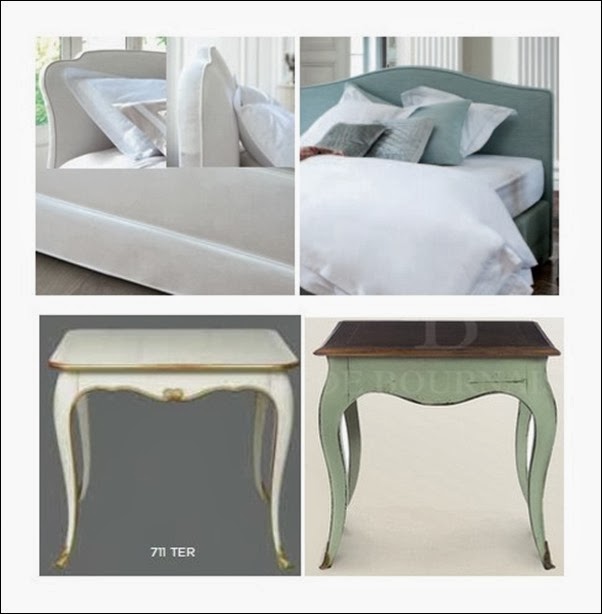
FurnitureBedding Styldecor; Nightstand cream Moissonnier; Nightstand celadon De Bournais


This pair of beauties will definitely be seen in the bedroom.

I found the chairs at Garnier Antiques.

Chairs Garnier

I hope you enjoyed my post of today and I do hope to show you the finished bedroom within a few weeks !


Talk to you soon !

xx

Greet

If you would like us to help realizing your paneling, feel free to contact us at info@lefevre.be

For more Lefèvre Interiors realisations visit our website at www.lefevre.be

Selasa, 29 Oktober 2013

Kitchens: Black, White and Gold

My biggest concern for the 'piano mansion' project that I'm working on is keeping it from being tacky or overt. I think with design there is power in subtlety and although the exterior is going to have a curvature and pitched roof recalling the shape of the piano, it will NOT be black and white. I'm thinking it will probably be grey brick but I'm still experimenting...any thoughts? I've also broadened my concept to the elegant and powerful experience of a concert hall in a larger sense. But I still want to pay homage to ebony and ivory keys through some of the interior finishes. This led me on a hunt for black and white kitchens. Add in some brass (think the orchestra) and we are really cooking.
via Betty Lou Phillips

via Betty Lou Phillips
Ali Cayne's Kitchen via Domino Mag
I mean...kitchen heaven or what? There's so much drama, yet so much traditionalism, in both of these spaces. And don't even get me started on the copper cookware. My parents have a set of copper measuring cups hanging on our kitchen wall and I've always loved them...imagine a whole pots and pans set!
xox
Photobucket

Sabtu, 26 Oktober 2013

Lefèvre Interiors & Natalie Haegeman Interiors featured in Belgian magazine


I am pleased and honored to announce that our work is featured in the latest issue of one of the leading Belgian interior design & lifestyle magazines : TIJDLOOS wonen !

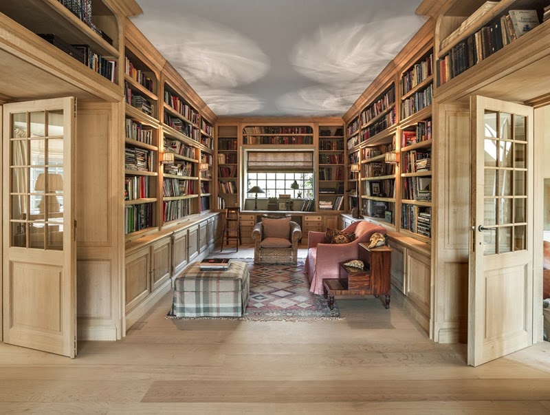
About a year ago the Belgian interior designer Natalie Haegeman asked our company Lefèvre Interiors for help to realize a library project she designed for one of her clients. Both, Natalie and I, were enthusiastic about this project and now we are proud to show you the result of our teamwork.

The library is made of French oak, not treated, which will give the cabinetry a used, natural patina.

This is a picture of the finished library, decorated by Natalie ! This is one of the featured pictures in the latest issue of the magazine TIJDLOOS wonen.

2Image source : Belgian Interior Design & Lifestyle Magazine TIJDLOOS wonen Nov-Dec-Jan 2013-2014 - Photography Claude Smekens


For more information :  WWW.LEFEVRE.BE       WWW.NATALIEHAEGEMAN-INTERIORS.BE


I would love to thank the entire team of the magazine TIJDLOOS wonen for this featuring. A special thank you to our renown Belgian photographer Claude Smekens for the gorgeous photos !

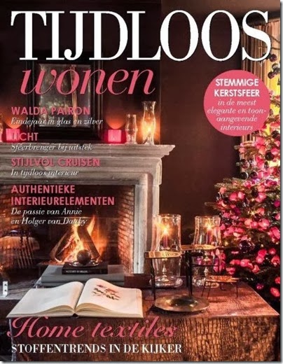
2013-10-26_113742Cover Belgian magazine TIJDLOOS wonen Nov-Dec-Jan 2013-2014

This latest issue counts a lot of interesting articles with beautiful inspiring pictures as the featuring about the Christmas decorated home of our Belgian designer Walda Pairon.

The cover of this issue of TIJDLOOS wonen shows the Christmas decorated living room in Walda’s house.

2013-10-26_114216Image source : Magazine TIJDLOOS wonen Nov-Dec-Jan 2013-2014 - Photography Claude Smekens.


This latest issue of the magazine TIJDLOOS wonen is now on the Belgian magazine stands !

I wish you all a wonderful fall weekend !

xx

Greet

If you would like us to help realizing your library project, feel free to contact us at info@lefevre.be

For more Lefèvre Interiors realisations visit our website at www.lefevre.be

Kamis, 24 Oktober 2013

Advanced Residential Project Inspiration: Piano Room & Sketches

First and foremost, I want to send a huge thank you and a warm hug out to each and every one of you for the overwhelming amount of support, encouragement and positive messages that I received through the blog, instagram and e-mail regarding yesterday's post. My heart is so full at the thought of this community and all we do for one another. :) You are the best.

Now onto a more fun topic. Last week I shared some details on this term's design studio - a 4000 square foot residential property which we get to design from the ground up. We received the program and the occupants are a family of talented musicians. They have a grand piano.
I actually took piano lessons when I was younger and while I never made it too far (I always hated practicing when I could be outside playing) I still plan on taking my piano with me into my first real house. All of this led me on a hunt for some piano room eye candy.
Stacey Brandford Photography via Desire to Inspire
via Robert Brown Interior Design
Atlanta Homes and Lifestyles via Little Green Notebook
I'm consulting with a talented piano playing young man (we will call him M.) on this project as a client sounding board. He says he would want a wood coloured grand piano, rather than black. Something like this I'm thinking...
via Markdsikes
I mean, burled wood? Let me pick my jaw up off the ground. Simply stunning.

 And while I know last week I said that my favourite old house is the direction I wanted to go in architecturally, I am now considering really running with this piano concept. I've sketched up some ideas for the shape of the house inspired by the shape of the piano and am really digging it. Realistically when am I ever going to be able to design a budgetless custom mansion? NEVER! Why not push myself to do something outside of the box? Here's a peek at my initial brainstorming work:
I might have to start practicing again, feeling inspired! Do you play an instrument?
xox
Photobucket

Rabu, 23 Oktober 2013

Changes: Life, Love and Loss

Today I'm over at Beth's blog DesignPOST participating in her Take Two series sharing the biggest and best changes I've made in both my space and my life. The bonus question asks what I would do if I had only five dollars...any guesses? Head on over and check it out
On a more personal note...
Thinking about changes has me reflecting on the past year and how much my life has changed. I'm so confident that I am following the path that I was born to take, but that doesn't mean the road has been easy. Four months ago I wrote a post hinting at some tough personal issues that I was going through. It was impossible for me to talk about then, still hard for me to talk about today - especially in a public forum, but as a blogger I feel it's important to let you all into my life. Not just the pretty parts, but the raw, personal parts too.
The fact is, in June my three year relationship came to an end. 
We continued to try to make things work for awhile after that, but at the end of the day we realized that we have grown apart and that it's time for us both to move forward. I have gained so much from what we shared and am so grateful for the relationship we had. He is a good man and I know that he will do great things with his life. I wish him all the best - the best life, the best love, the best friends. 

I'll be honest, after it ended I fell into a pretty big slump. I questioned my choice, what I was doing with my life, if I was on the right path, what would have happened if I had stayed in my hometown. It's never easy to let go, even when you know it is the right thing. But as the months have passed I've gained confidence in my decision and am moving forward. I'm ready to open my arms to new opportunities and accept all that is coming for me. I know today that no matter the circumstances, the outcome would be the same - God has His plan and I am so excited for all that it entails. I feel fate at work. I feel something special in the air. I wake early every morning healed, thankful and ready.
To myself and anybody else going through something similar I say this:
Keep your chin up. You are worth it. You are strong. Don't be afraid to be alone. Don't be afraid to fall in love again. Don't think you are incapable of staying in love - when you find the right person it will stick. There is someone out there completely right for you, so right that everything you've gone through will make sense. Don't let fear paralyze you. Your happiness must come first. Take chances and listen to the voice in your head, trust your gut, and most importantly follow your heart.

Have a blessed day my loves. xo
                                                           Photobucket

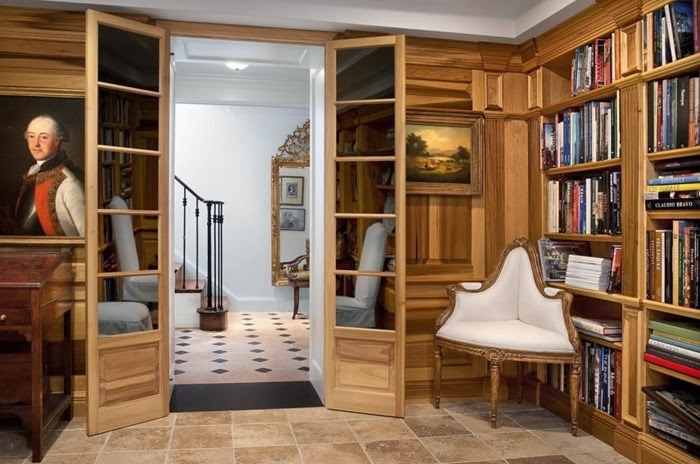
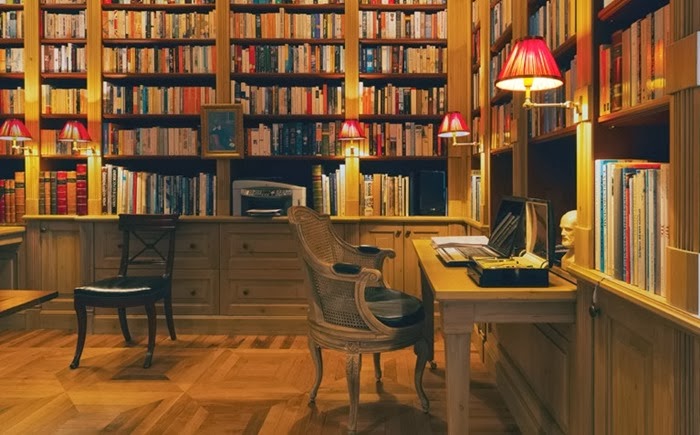
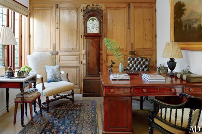
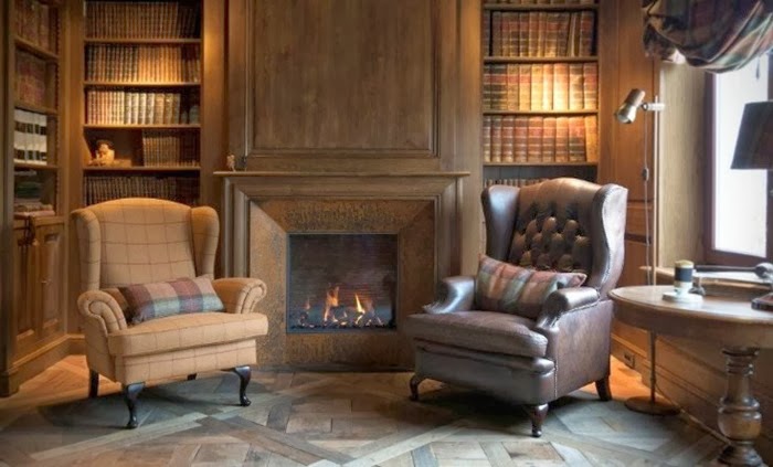
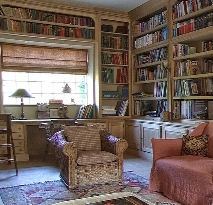
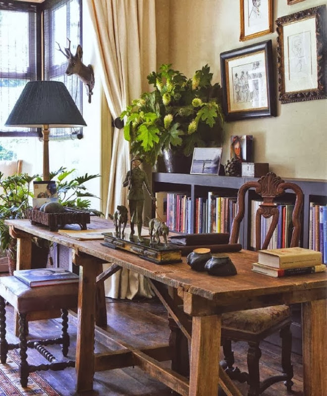
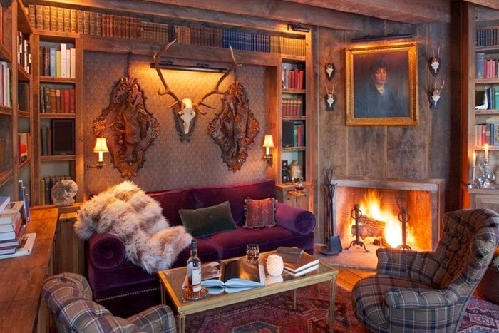
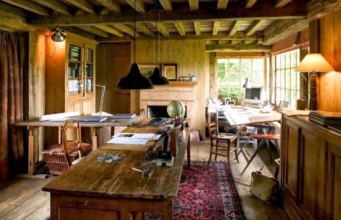
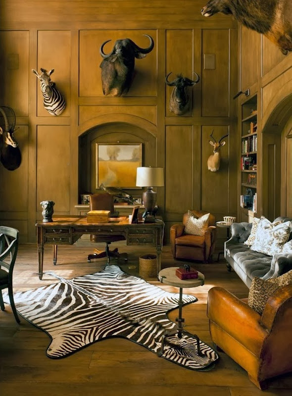
Library - study rooms where I would like to work


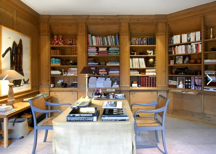
Aren’t you agree with me that it must be wonderful to work in one of these library-studyrooms , especially at this time of the year when days become shorter and it is getting colder outside. I love to be surrounded by wood, that definitely makes a study room warm and cozy.


4Interior design Christine Bekaert


7Image source Thorsen Construction


10Interior design Decoration Empire


6Home office of antiques dealer Lee Stanton  Source Lee Stanton blog


3Interior design Antiek Amber


9Interior design Natalie Haegeman – realization Lefèvre Interiors


8Interior design Beatrix Kleuver


2Interior design Grant Larkin


1Image source Immo Dochy


5  Thompson Custom Homes  Image source Houzz


Work with joy!


xx

Greet

Selasa, 22 Oktober 2013

K.R.T. Home (and a favour pretty please!)

I've said it time and time again. If there is one thing that keeps me blogging, it's the amazing community of lovely bloggers I've met here who act as constant support, mentors and friends.
One such amazing person is Kristen of Just a Girl and her Little Dog who has been with me since I first started my blog!
Now it's time for me to pay it forward to this talented lady with an eye for vintage goodness you won't want to miss. I'm so proud of Kristen for the launch of her new online shop K.R.T. Home. The collection she has put together is amazing. I wish I had more room so I could scoop up every.single.piece!
I've hand picked some of my favourites below. Hurry before they're gone!
^I can't handle the pretty. Pint sized and perfect for a nursery.
It also comes in navy velvet...I die.
^ This marble and glass cheese dome would make a perfect hostess gift. Cheese is my favourite so I'm biased.
^Isn't little Lola the perfect mascot?

Congratulations Kristen! I just know it's going to be a HUGE success.
Be sure to visit K.R.T. Home

Lastly, I'm asking for a favour from all of you. This weekend I was nominated for a 'top ten interior design blogs' list and voting is open for favourites! If you could head on over HERE and cast a vote my way I would love you forever (already do though). Thank you SO much in advance.
xox
Photobucket

Senin, 21 Oktober 2013

One Room - Two Palettes: Transitioning your Home Decor for Fall in Five Minutes

We all know that the big trend I am loving for fall is black and white. I say 'trend' because it's a popular look this season, but let's face it, black and white is about as classic and timeless as it comes. While during the spring and summer my space employs a bright, lively and colorful palette, I decided to try on a different look for the colder seasons and went glam with black white and gold.
The changes were simple and only took about five minutes to complete. I didn't buy anything new, just used items I already had around my place.This goes to show you that switching up your decor doesn't have to cost a lot of money or take a lot of time. Also don't be afraid to improvise! The dalmation dot pillow cover is really a dress from H&M tied around a pillow form. Shh don't tell!
First I switched out the art pieces. Next I traded the colourful throw pillows. Lastly, I changed the items in my tray to fit the scheme.
Decorating Tip: Removing the dustjacket off of your books will often reveal more neutral covers!
I like any excuse to play around and experiment with styling. Do you change the palette of your rooms with the seasons? I hope you all had a great weekend
xox
Photobucket