 |
| 1 / 2 / 3 / 4 / 5 |
 | |
| Designed by Kelly Wearstler via O at Home Magazine |
 |
| via Atmosphere Interior Design Inc. |
 |
| via Apartment Therapy |
 |
| via Design Darling |
 |
| via House Beautiful |
xox
 |
| 1 / 2 / 3 / 4 / 5 |
 | |
| Designed by Kelly Wearstler via O at Home Magazine |
 |
| via Atmosphere Interior Design Inc. |
 |
| via Apartment Therapy |
 |
| via Design Darling |
 |
| via House Beautiful |
I have to admit that I do have a weakness for antique cupboards. This type of furniture can be placed in several rooms of the house and can be used for different purposes. They can be functional or they can be used as a decorative piece of furniture.
In a dining room they can be used as display cabinets, in a kitchen they can be used as storage. You even can use them as curiosity cabinets in your study room.
A beautiful antique cupboard in a house in France.
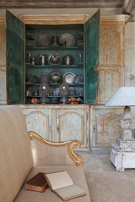 Photo credit James Balston Image source here
Beautiful cupboard in the dining room of Brigitte Garnier.
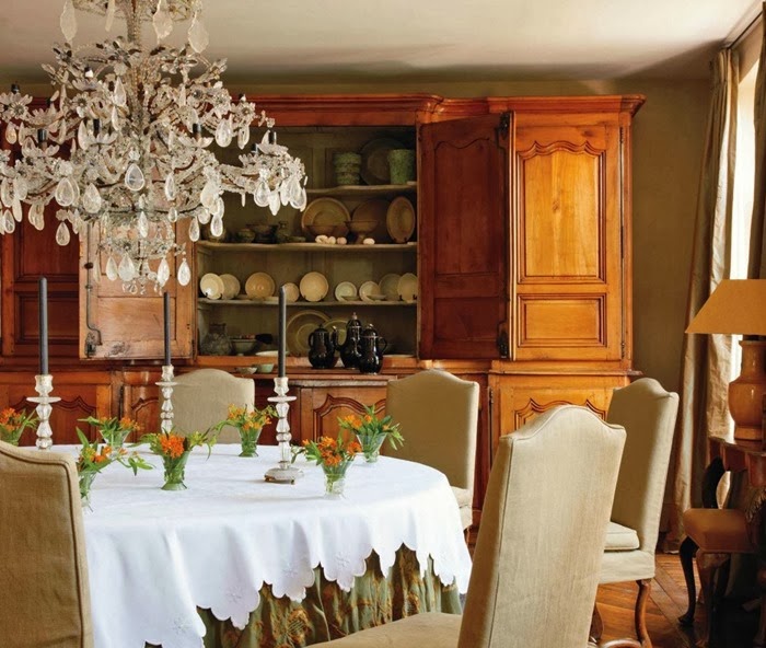 Photo credit Miguel Flores-Vianna Image source Veranda Magazine March 2011
This cupboard Brigitte Garnier placed in her kitchen, has a functional use but even looks very decorative.
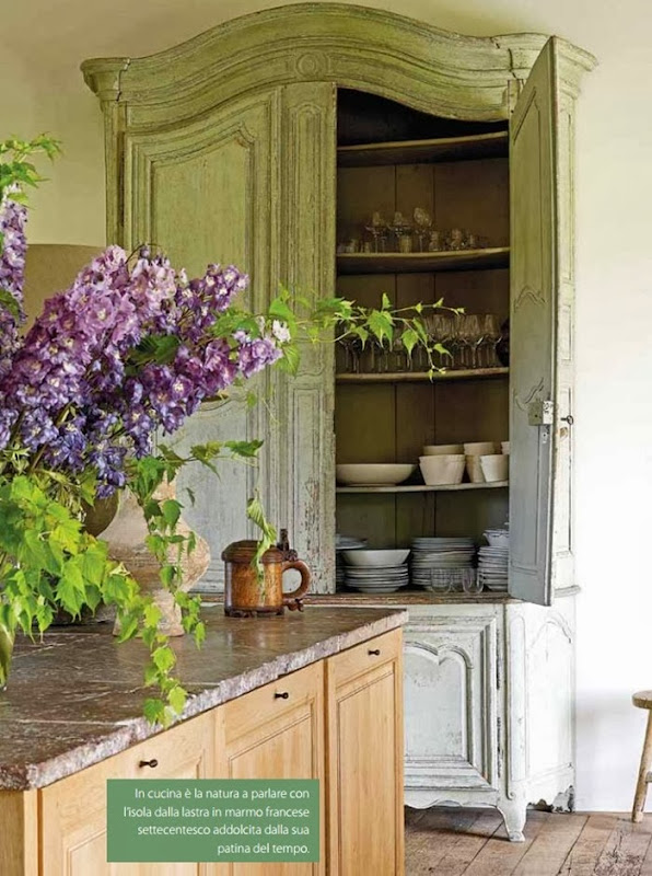 Image source Vivere Country Magazine 2011 Photo credit Claude Smekens
Another beautiful antique cupboard at Garnier Antiques. French oak cabinet with painted interior.
French 18th century painted cupboard I placed in my sister’s home.
A cupboard used as a ‘cabinet de curiosité’ in the study room of Belgian fashion designer Edouard Vermeulen.
I wish you all a wonderful weekend!
xx
Greet
The currently Paris based Belgian designer Ramy Fischler of the firm RF Studio, was asked to renovate and to breathe new life into a duplex apartment in a listed Art Deco building in Paris.
He wanted to get a lot of daylight into the paneled rooms and brightened up the rooms by painting the top of the French 18th century paneling with the same brilliant white as the ceiling.
The paint fades out, leaving the natural-finished oak visible.
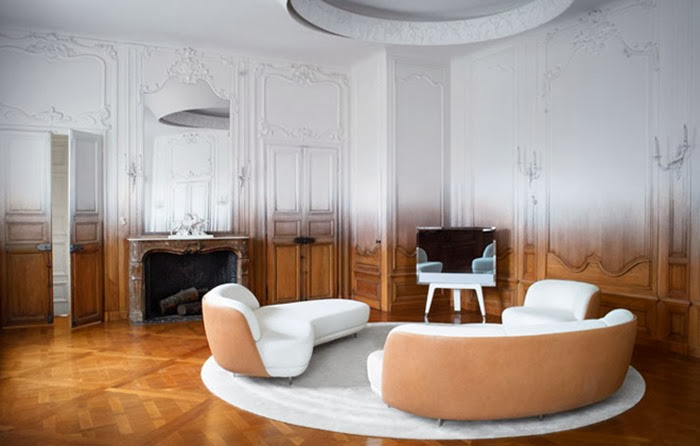 Living room Image source here – Photography by Paul Graves
By taking tradition and craftsmanship as a starting point to create contemporary design, Ramy Fischler shows respect for authentic elements.
Although the paneling is given a modern twist, the rooms retain their authentic look but lighter and fluffier for the eyes.
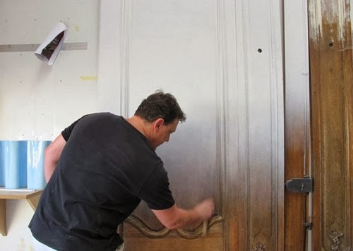 The making of the woodwork in the living room. Image source here - Photo RF Studio
 Dining room Image source here – Photography by Paul Graves
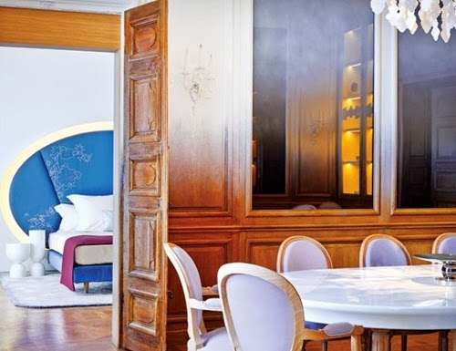 Image source here - Photography by Eric Laignel
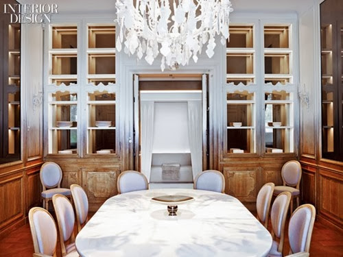 Image source here - Photography by Eric Laignel
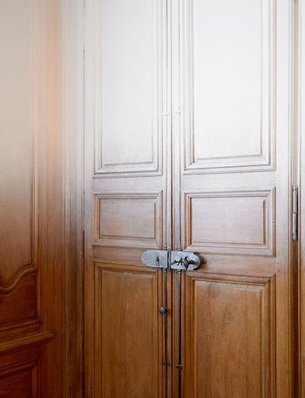 Image source here – Photography by Paul Graves
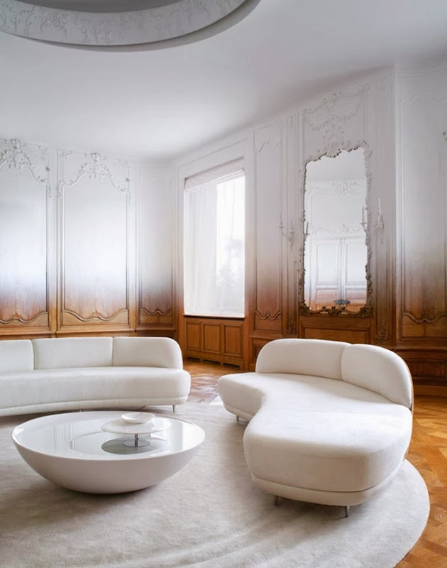 Image source here – Photography by Paul Graves
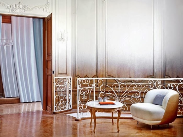 Image source here - Photography by Eric Laignel
Ramy Fischler founded his design firm in 2010. He is a graduate of the Ecole Nationale de Création Industrielle, ENSCI-Les Ateliers and was the exclusive partner of Patrick Jouin for nearly nine years.
To see more of Ramy Fischler’s work, please visit his website RF Studio.
I just love Ramy Fischler’s design approach. Really brilliant!
What are your thoughts about it ?
xx
Greet
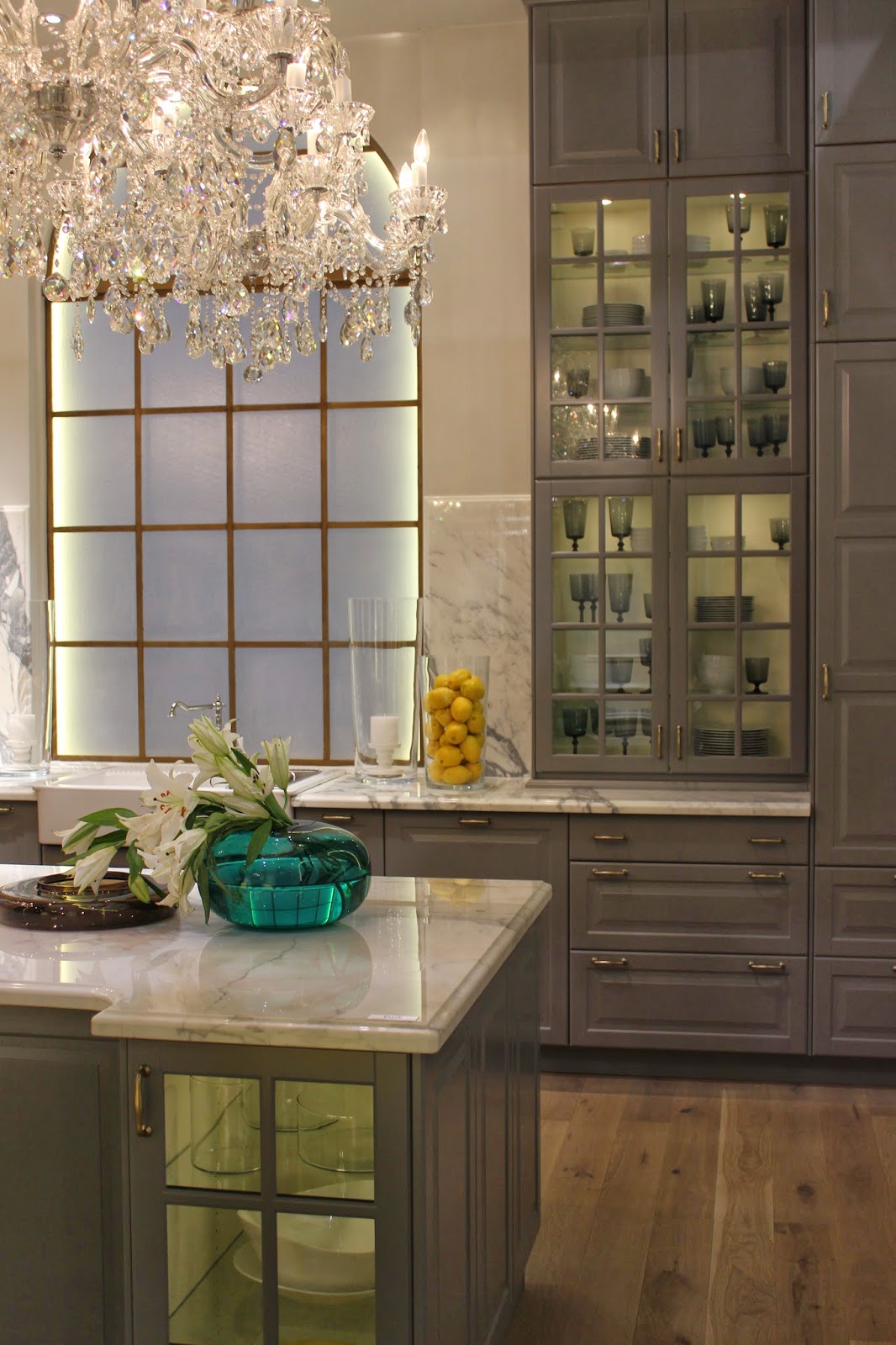 |
 |
| via Sarah Richardson on Instagram |
A few days ago we visited a client's house where we installed a kitchen 2 years ago and to my surprise I noticed that the kitchen cabinet space that was meant to store the cutlery, was now used to place the wine bottles!
I actually think it is a splendid idea and a gorgeous alternative use.
I absolutely wanted to share the idea with you today.
 LEFEVRE INTERIORS kitchen design Photo by me
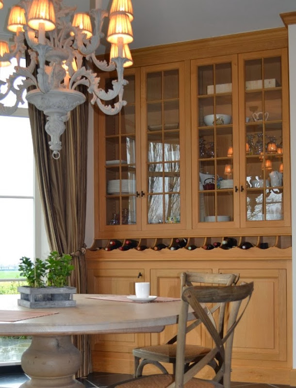 LEFEVRE INTERIORS kitchen design Photo by me
Enjoy the weekend!
xx
Greet
If you would like us to design your kitchen, feel free to contact us at info@lefevre.be
For more Lefèvre Interiors realisations visit our website at www.lefevre.be
 |
| via |
 |
| via Katie Armour |
 | |
| source unknown |
 |
| via Live Creating Yourself |
 |
| via Design Darling |
As I have a passion for books, in particular interior design books, I love spending hours in our library. When I need inspiration to design a client’s library or complete interior design project, I close the door of our library, put on my favorite music and start consulting my collection of interior design books.
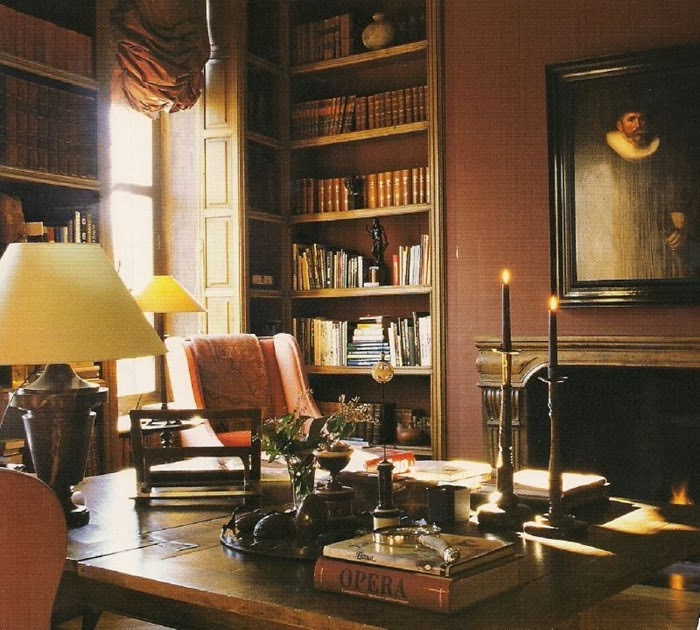 One of my favorite images is this library designed by Axel Vervoordt Image source here
Can you imagine, sitting in a comfortable chair next to the fire place, curling up with a book? Definitely a treat for the soul!
Designing a library, you have to pay attention to details.
Notice the bookcase details here. Awesome!
 Image source here
And I do love to bring in secret library doors, if possible.
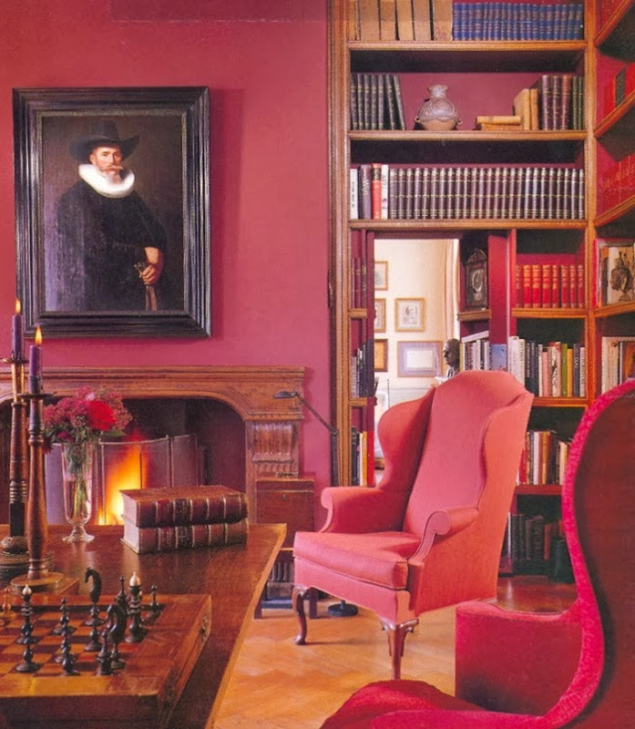 Library design Axel Vervoordt Image source AD July 2003 - Photo credit Durston Saylor
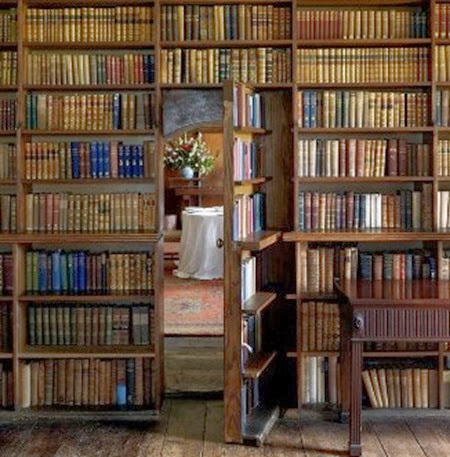 Image source Pinterest
What I love more in all these shown libraries, is the painted back of the bookcases.
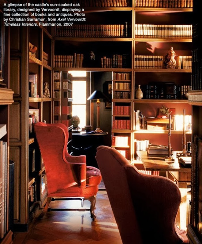 Library design by Axel Vervoordt Image source here - Photo credit Christian Sarramon
This is exactly what I did with the cabinetry in our own library.
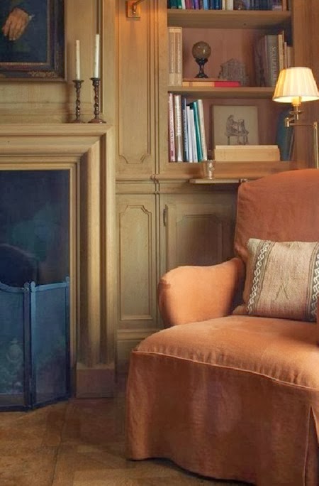 Library design Lefèvre Interiors Photo credit Thomas De Bruyne
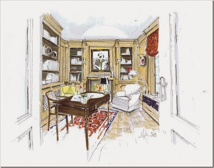 I am still thankfull to my blog colleague Michelle Morelan for the rendering she made of our library a few years ago.
If you need inspiration to furnish or to decorate your library, I discovered an interesting feature on 1STDIBS with great addresses to find library furniture and accessories.
 If you are feeling bookish, click here to discover the 1stdibs library collection.
Wishing you all a wonderful day!
xx
Greet
If you would like us to design your library, feel free to contact us at info@lefevre.be
For more Lefèvre Interiors realisations visit our website at www.lefevre.be
 |
| Joe Nye via House Beautiful |
 |
| via Emily Henderson |
 |
| Loeffler Randall via Domino |
 |
| via Source42 |
 |
| Jess Lively via Pretty Fluffy |