Minggu, 08 Januari 2012

Planning my Gallery Wall

When I finally get my own place, I NEED a gallery wall. Gallery walls are everywhere I look lately, and I'm taking that as a sign. I absolutely love the eclectic, pieced-together-over-time look that it creates, and the injection of personality it can add to any wall. Although a gallery wall is definitely not a new idea, it's one I just can't ignore. I thought I'd share with you some spaces I love, some of the pieces I have already collected for my future wall, and some pieces I have my eye on.

Image via Style by Emily Henderson
^ Emily Henderson is one of my favourite designers. She was the winner of HGTV's Design Star season 5 and her blog really shows off her quirky and witty sense of humor. Flipping through her portfolio, you see that she has absolutely mastered the tricky art of the gallery wall. The picture above demonstrates that. I love the heart print. She uses each piece to add a unique twist and pop of colour to the room.

Image via designerh0mes
^ The picture above shows that you can use more than just framed art on a gallery wall. A clock, decorative plates and colorful tiles also can help finish off the look.

Image via
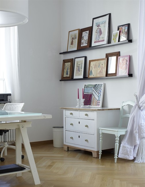
^ If you just can't commit to the time and mess that it takes to plan the hanging of a gallery wall (see the whole 'how-to' over at Nothing but Bonfires -blogger Holly Burns has an amazing, hilarious, and informative post about the entire process), or if you feel uneasy about putting all those holes in the wall, then photo shelves can help you create a similar look while avoiding these hazards of gallery wall-ing. The beauty of using photo shelves is that you can easily switch up your artwork whenever you choose!

My Gallery Wall Pieces:

 Pieces I already have:

 ^This is one of the prints that my parents' got in the Bahamas on their honeymoon over 27 years ago. They are still happily married, and to me, this print represents the beginning of that marriage. I also love its simplicity and the calm, fishing town vibe captured the image. Still needs a good frame.

^ This is a print of a photograph by Ivan Fraser. It captures the beauty of Nova Scotia's Peggy's Cove. My boyfriend goes to school in Halifax, Nova Scotia. On a recent trip to visit him we spent the day exploring the Cove. It's so breathtaking! I got this print and am saving it for my gallery wall. Oh the memories! Also needs a good frame. (See me and the bf at the lighthouse below!)


Items on my wish list:

^ I am in love with the paintings by Jen Ramos for Coco and Hearts. So many beautiful colours to choose from! At 10" x 8", they are the perfect little size for any gallery wall. (You might recognize her work as the background of my designer lifestyle blog header!)

^ Did I mention how talented Jen Ramos is? Oh, well, if you need further proof, I need this Love Candy Print in GOLD that she designed. A deal at $35.
 ^ This poster by Row Boat Press, discovered via the 'how-to' post by Holly mentioned earlier. I find this quote so romantic and everlasting. It really gets me. Get it for only $15.

A bit of a long post, I apologize! Do you have a gallery wall in your home? I'd love to see it! Any perfect piece recommendations?

Love always,
Tiffany Leigh

Sabtu, 07 Januari 2012

SATC: Carrie Bradshaw's Interior Style

I’m quite sure that many of you will agree with me when I state that Carrie Bradshaw has become a major fashion icon of this generation. As a fictional character on the hit show Sex and the City, Carrie epitomizes the type of woman many of us strive to be:
Sexy, Confident, Successful, Honest, a True Friend, and of course Stylish.
While her infamous closet is stuffed full of wearable treasures (from pricey designer labels to vintage second-hand finds), her interior spaces have also become iconic and drool worthy and mustn’t go unnoticed.
Here is a look at some of my favourite of Carrie Bradshaw’s interior stylings…sets that provided the perfect atmosphere for the trendy, downtown New York dreamer as we as an audience experienced her life.


 ^Carrie’s closet in her original apartment is my favourite space.
Why not have a little fun in the walk-in closet? Carrie experiments with colour, rug choice, and funky lighting. Her colourful clothes compliment the space perfectly…or is it the other way around?

Get the look in your closet:
Paint colour: Pick a dark, rich, greyish blue. I like Benjamin Moore's Wolf Gray

 Rug: Any bright and girly floral rug will do, like the one below from Urban Outfitters for only $34!


via Urban Outfitters
Lights: Decorate your own oversized white drum shades with a black fabric marker and hang them as pendant light fixtures to achieve the look of Carrie's closet lighting.


Other spaces:

 ^ Carrie and Big’s closet.
A much more grown up, organized closet than when Carrie lived as a bachelorette. I think the difference in cabinetry marking a masculine and feminine side is absolutely brilliant (and I love her clothes spill over onto his side).

^Carrie’s original bedroom.
Such an eclectic, lived-in look. Each piece looks flea-market picked. This is a personal favourite and much preferred to her renovations in the movie SATC 2, which I found just too neat for Carrie.

^ Carrie and Big’s living room.
A little masculinity for him in the sofa, a little femininity for her in the blossom rug. A perfect blend for the newly married couple. The artwork above the couch is stunning, simple, and adds the perfect pop of colour.

Although Carrie is definitely known more for her fashion than her apartment, I just can’t ignore design this good. Have you noticed Carrie's apartment while watching? Which is your favourite look?

Love always,
Tiffany Leigh

Jumat, 06 Januari 2012

Donde esta el baño?

For you non "spanglish" speaking folk

I just asked you "Where is the Bathroom?"

Well, no need to answer cause I got a few for your viewing pleasure ryte heyaaa

Rustic and Homey??


"Clean and Classic"


or

Funky Nuts?


The Duck and I are gearing up for 2 bathroom renovations...I need all the inspiration I can get

BTW: If you want to, Please comment with links to pictures you think I must SEE.

ALL THE IMAGES ARE FROM PINTEREST

Kamis, 05 Januari 2012

Favourite Furniture Fridays: Eero Saarinen Tulip Table / IKEA Docksta table

 Take a look at this beauty:

via IKEA
Last Favourite Furniture Friday, I took a look back at the history of the iconic Eame's Lounge. I can certainly do the same of today's Furniture Favourite because the IKEA Docksta table is in fact a fairly obvious replica of the very famous Tulip Table designed by Eero Saarinen for Knoll. Although IKEA has achieved the table at a much more affordable price, Saarinen deserves full credit for this beauty. The Finnish American designer created an entire Tulip line around 1956. The modernist piece is still popular today, and the Knoll Tulip dining tables range in price from $1,800 to a whopping $14,000 depending on size and finishes. See Knoll's version below!

via Utility Design

 So, let me outline the obvious and not so obvious differences:
1. The 'stem', or table leg, is considerably narrower in the original Tulip Table. Also, you can also see two seams on the IKEA version's stem where it connects to the table top and the base. The original is seamless.
2. Table top material: The IKEA table top is made of fiberboard and acrylic paint, whereas the Knoll version is available in laminate with the option to upgrade to a marble top.
3. Table base material: The IKEA base is made of Reinforced Polyamide, the Knoll uses heavy cast molded aluminum.
4. While the Docksta comes standard, the Tulip Table comes in a variety of sizes, finishes, and shapes, including oval (like the photo below).
via Decor Pad
 But perhaps most importantly for the forever budget-minded like myself, the IKEA version amazingly retails at only $229.

I much prefer the price tag of the IKEA table, so its gets my vote! At 41 3/8" it's the perfect size for tighter spaces. It's also a multi-use piece. Check out the following examples of IKEA's Docksta in action:


via Decor Pad
^Perfect set up for working or dining. The neutral table pairs well with the bright bursts of colour, and the simplicity of the design allows its modern aesthetic to compliment, rather than contrast, with more traditional pieces.


^ Bachelorette Jillian Harris's living and dining space. See the Docksta table tucked in the back there? Well, okay, I'll admit that it might be an original Tulip Table, but the stem looks a bit thick in this photo. Either way, the table is the perfect size for Jillian's compact little eat-in kitchen. The entire space is to die for. Amazing taste!

So, who wants to go to IKEA with me? Any takers? Do you like this table?
Happy Friday! xo Tiffany Leigh

A Regency styled library

As I told you in my earlier post, I was preparing upcoming meetings with clients these passed days and was browsing into the Lefèvre Interiors realizations file and found these pictures of an earlier library project.

The library is installed in a Brussels mansion and is designed in the British Regency style.

The bookcases are executed in mahogany, that was very popular in the early 19th century Regency style (1811-1820).


This was our initial design sketch.

Lefèvre Interiors design sketch


I remember me discussing about the Regency style with the home owner (the Regency style was his favorite design style) and we talked a lot about Thomas Hope (1769 -1831),  who was not only a Dutch and British merchant banker, author and philosopher but also an art collector.

Hope was eager to advance public awareness of historical painting and design and to influence design in the grand houses of Regency London. He began sketching furniture, room interiors and costumes.

In 1807 Thomas Hope published sketches of his furniture, in a folio volume, titled ‘Household Furniture and Interior Decoration’  , which had considerable influence and brought about a change in the upholstery and interior decoration of houses. Hope's furniture designs were in the pseudo-classical manner generally called "English Empire". It was sometimes extravagant, and often heavy. It was a  mixture of Egyptian and Roman motifs.


Household Furniture and Interior Decoration (cover)Book Amazon


Thomas Hope furniture and interiors

source here

2source here 


0ur client finally loved this design.

Lefèvre Interiors 012

Do you recognize the Egyptian and Roman motifs of Thomas Hope’s Regency design style?


Lefèvre Interiors 007

I do love the way the wood is stained.

Lefèvre Interiors 011

As you can see we are not only installing libraries in oak wood. We are able to work with the most noble types of wood, here at

LEFEVRE INTERIORS  .

Lefèvre Interiors 009

Lefèvre Interiors 015 

Lefèvre Interiors 008

Next time I visit Brussels, I really have to see my client to take some pictures of this finished library room!

xx

 Greet